


Book Essay #2: Front Cover

Book Essay is a series of narrative/descriptive essays on the parts of a book. From the spine to the back cover, each essay will convey my thoughts (largely subjective) on the components of each part of a book—one essay for a book part. These essays will create the awareness that a book is made of many parts, and show how these parts, put together, make the beauty that a book is. I hope that these musings get us into a conversation in the comments. For me, it is a setup that makes me dig deeper to understand the parts of a book. Therefore, these essays will not be preceded by extensive research on the book part. You can be sure to find errors in factual details. But let me be wrong, this one time, since I would do research afterwards. (But flag down my errors, please!) Worry not, the essays are numbered!
Dear Fellow,
If you carefully read the preamble, you will do to me one of two things or both—after a confession. You may be happy for more, or you will frown at me. The confession: I have five other tabs on my browser as I write this book essay. Paper True, 99designs, Reedsy, NY Book Editors, and Shutterstock—leading sources for information on the art of bookmaking. That line in the preamble, “Therefore, each of these essays will not be preceded by extensive research on the book part”? Well, I have a lot to say about the front cover of a book, and reading further about the subject was a means to declutter—more like a means to unbundle the threads of thought into a cleaner piece. It helped!
In the previous essay, I said the first part of a book you interact with on a shelf is the spine. Pay a visit to any library or bookstore nearest to you and see for yourself. Next, you are more likely to interact with the front cover. (I am thinking of a situation where I didn’t consider the front cover of a book before any other part. Even if the front cover is torn, it still maintains its place—second to the spine, if picked from the shelf.)
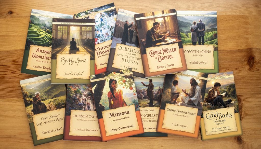
All the sources I consulted before writing this essay agree on three basic elements of a front cover—book title, author’s name, and imagery. One source calls them “The non-negotiables”. Extras on the front cover include endorsements and/or reviews, and a logo of the publisher. The front cover of a book is responsible for telling you enough to get you more than half the road to decide whether to read the entire piece. Doesn’t that sound like judging a book by its cover? Well, how many of us don’t judge a book that way?
I think the popular saying “Don’t judge a book by its cover” has been misinterpreted among readers and publishers in my city. I have been in several book rooms where I was asked to pipe low about my displeasure toward the front cover of a book. The problem has always been the imagery. I mean, it is better to have a plain background for the front cover, with the book title (and subtitle), the author’s name, and the endorsements. A common observation across the sources listed above is that a book’s prospect of becoming a bestseller is highly and directly proportional to the effectiveness of the book’s cover—especially the front cover. Second to the back cover in text, the front cover is the most elaborate visual invitation to read your book.
I had a special encounter with the front cover of a book that I will save for the last bit of this essay. Before then, a little pondering on the elements of the front cover. Among the three main elements, which should be most prominent on the front cover—book title, author’s name, and imagery? Which is the most effective selling point for a book? This paragraph from Reedsy comes in handy:
“The title of the book and the author's name aren't carelessly slapped onto the book's cover without any thought. The font, size, and placement of any text are key elements of book cover design—not only can it be used to catch a reader's eye and guide them to the most essential information. That's why the names of well-known authors are often more prominent than the title of their book, while debut authors will put more focus on an intriguing title.”
Observe that conflict of interest between projecting an author’s name and the title of his work. In that light, the imagery (also known as the cover art) becomes the platform where both the title of the book and the name of the author project their relevance. Perhaps the story in a book should have more effect on a potential reader than the author’s name on its cover. And so, the cover art must be good to not only serve as a platform for both the book title and author to sell themselves to a potential reader, but it should serve as a complementary element for both.
The front cover of the book Lord Foulgrin’s Letters by Randy Alcorn remains the best I have come across this year. It took me beyond half the road to decision-making whether to read the book or not; it gave me a significant idea of the book’s content. On seeing the cover and reading the title, I was certain it was a collection of letters like C. S. Lewis’s The Screwtape Letters: Letters from a Senior Devil to a Junior Devil.1 More so, Alcorn stated in the preliminary pages that his book’s idea came from Lewis. I give the book’s cover designer credits: Uttley DouPonce Design Works.2

In conclusion, I invite you to join me and think aloud about this. “What do you think of A Slip of the Tongue as a title for a book of talks and papers?” C. S. Lewis (1898-1963) was quoted to have asked a friend in a biography by George Sayer. “Almost the most difficult part of a book is finding a title that will satisfy one’s friends and the publisher.”3 Your task: briefly describe the imagery you will use for a book titled A Slip of the Tongue. A bleeding tongue? Kindly share in the comments section, please. Thank you.
See you in the next book essay—and in the next despatch. Thank you for stopping by.
Your LetterMan,
Tongjal, W. N.
C. S. Lewis, The Screwtape Letters: Letters from a Senior Devil to a Junior Devil (Fount Paperbacks, 1977).
Randy Alcorn, Lord Foulgrin’s Letters (New York: Multnomah, 2001).
George Sayer, Jack: A Life of C. S. Lewis (Wheaton, Illinois: Crossway, 2005).
For the imagery of the book, I wouldn't use the image of a bleeding tongue, I would use the color red though.
It will be the image of lips that are slightly open, with a slip of paper(red paper of course😂) coming out of them.
Or an image of a person talking with letters (red as usual😂) FALLING out of the person's mouth.
"I have been in several book rooms where I was asked to pipe low about my displeasure toward the front cover of a book" 😂😂, oh what i'd give to see that.